
Code EARTH15 applied for 15% off!

Subtotal
$0
U.S. Shipping
FREE
Saved for Later
Shopping Cart

Code EARTH15 applied for 15% off!

Subtotal
$0
U.S. Shipping
FREE
Saved for Later
I am often asked how I see the colors I see when I am painting. This question has been on my mind lately, and I thought you might enjoy hearing about how I approach color in each new painting I begin.
My first step is to find the spark of inspiration—the thing that makes me want to transform a blank white canvas into something beautiful. I have never been great at inventing subject matter out of thin air—instead, I am inspired by things I see in the world around me. And to me, the most beautiful sights are found in natural landscapes.
When I head outside and look around to find something to paint, I am looking for something unusual—something that captures my attention, something that stands out in a way that feels special. I am attracted to areas of high contrast, vibrant color combinations, and striking physical formations. For example, while walking along a path in the lush, spring-green Texas hill country, I might see a baby blue sky adorned with white clouds, vibrant green oak trees, and apple-green grass. Yet, what truly captures my attention is the flurry of Indian paintbrushes—bright red and vivid—set against the rich green backdrop.
These brilliant red flowers become the starting point for my painting. But how do I translate the emotion and beauty of that moment to my canvas? How can I evoke the same ache of wonder in you, the viewer, that I felt when I first saw this scene?
There are many ways I could go about painting these flowers. If I wanted the communication to be all about the warm color of the wildflowers, I might paint the sky a sherbet orange, the trees and grass a warm-hued green, and have an explosion of orange-red Indian paintbrushes in the foreground.
A second option would be to paint a close-up, semi-abstract painting emphasizing the contrast of the fiery orange-red petals against a static green background. This sharp juxtaposition of complementary colors—red and green—would certainly create a dramatic emotional impact.
For this scene, however, I want to capture more specifically how it felt to be walking along in a green-and-blue-saturated landscape and be struck suddenly by the vivid unusualness of the wildflower patch. To achieve this, I plan to create a large-scale composition where the sky, trees, and grass are nearly uniform in color and value—subtle shades of blue and green that blend harmoniously. I’ll include a winding path, drawing the viewer into the scene and evoking the sense of discovery I felt.
Before starting the painting, I typically do a small pencil sketch with color notes. These preliminary studies help me clarify my vision. As you know, one of the hallmarks of Open Impressionism is my technique of not overlapping or correcting brushstrokes. This approach means I must pre-plan and pre-mix all my colors before I ever pick up a brush. I need to see the finished painting in my mind before I begin.
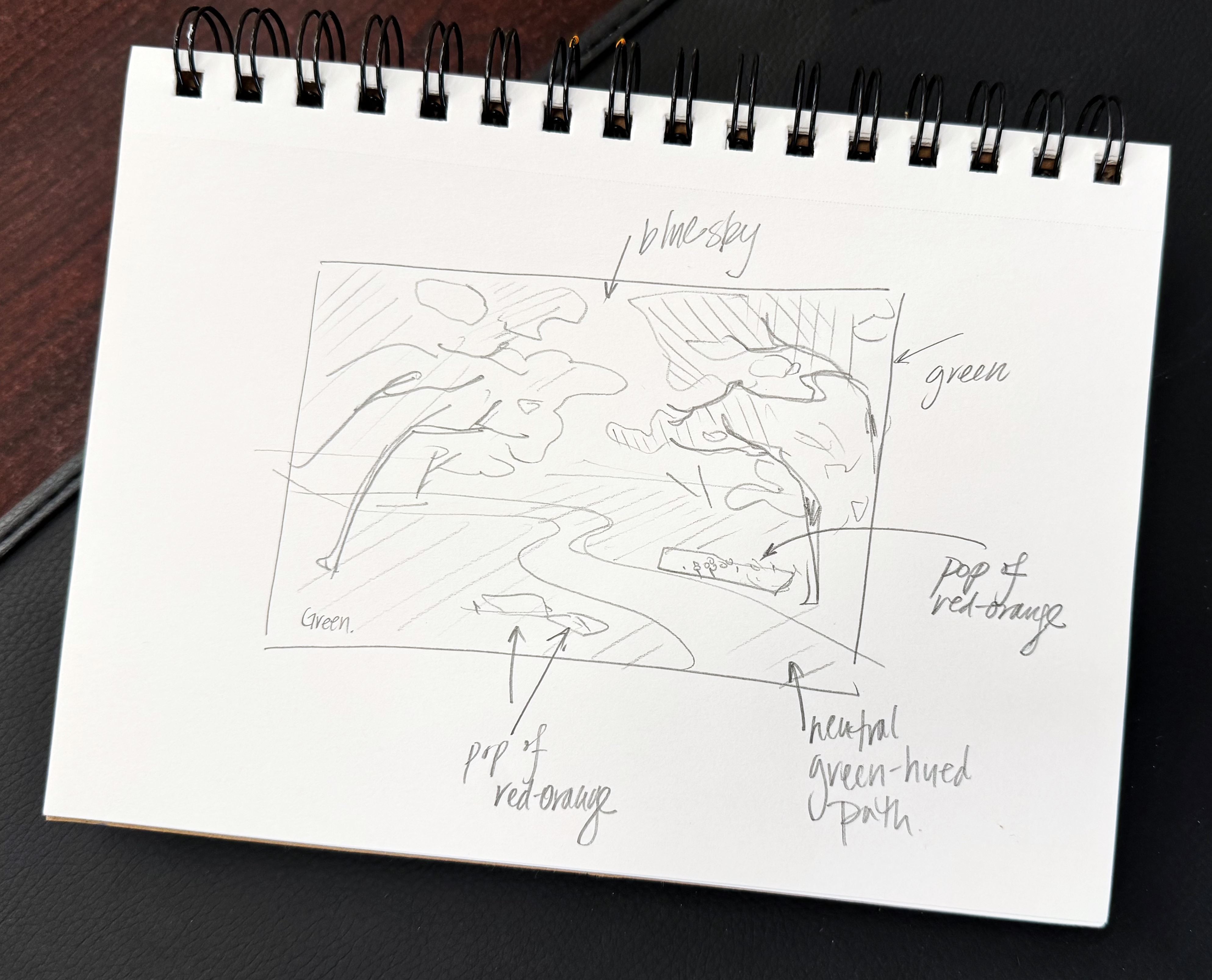
Here is a sketch showing the scene I just described.
As I am writing this article, I haven’t painted this scene yet, but keep an eye on my portfolio to see the completed work!
Let me share a couple more examples of how I use color to shape my compositions.
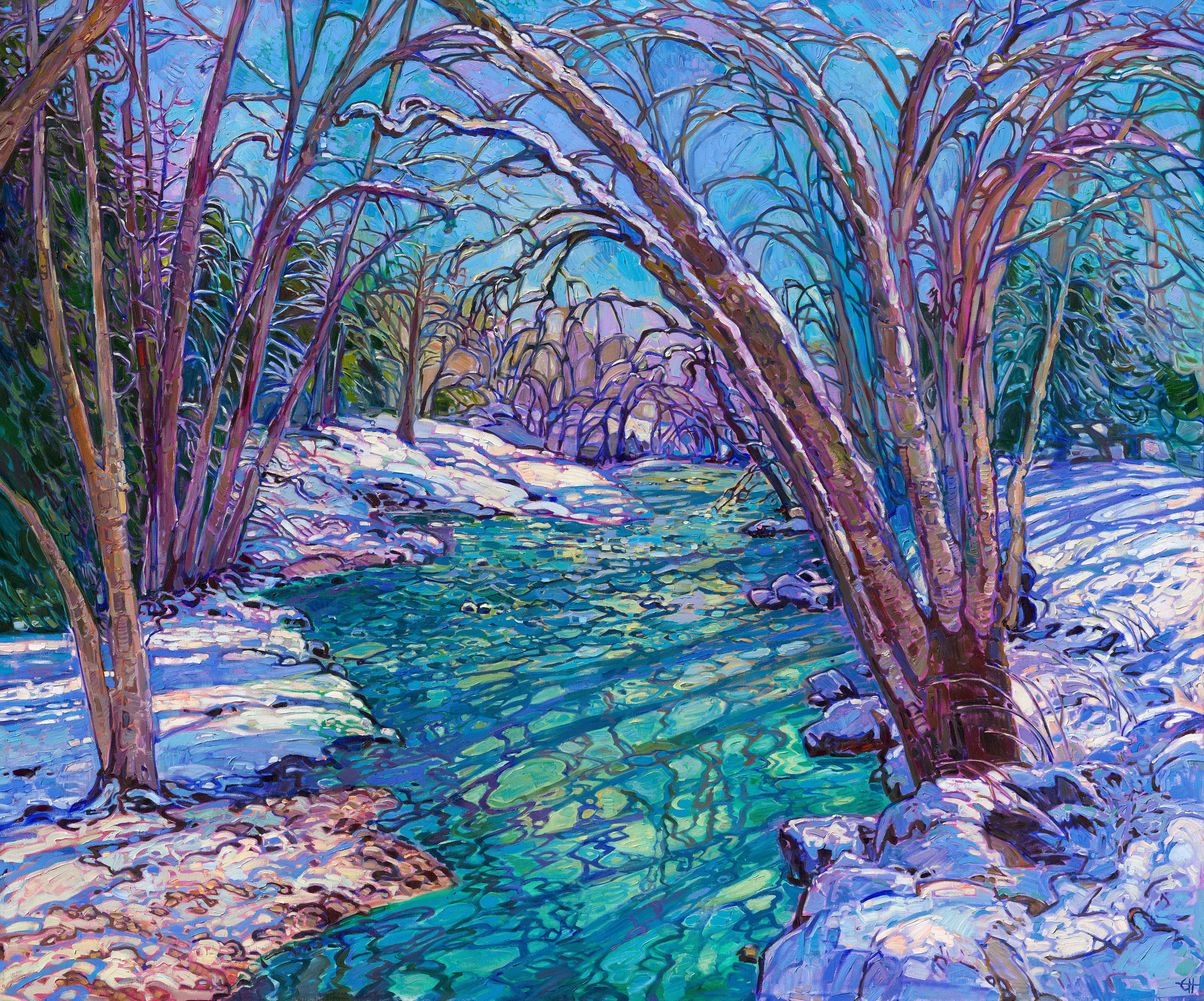
Prism Blues by Erin Hanson, 2024
I recently finished a snow painting (Prism Blues, above), Snow isn’t a subject I often paint, so I wanted to create something distinctly cool and atmospheric. To achieve this, I avoided warm cadmium tones in my underpainting. However, I needed enough color contrast so the painting wouldn’t turn out all winter whites and blacks, so I decided to use green and purple as my main color focus and stay as monochromatic as possible within that range. Therefore, I divided my underpainting between purple and green: green for the areas beneath the sky and water and purple for the areas beneath the snow. Using two different underpainting colors helps differentiate the way the viewer perceives water versus snow.
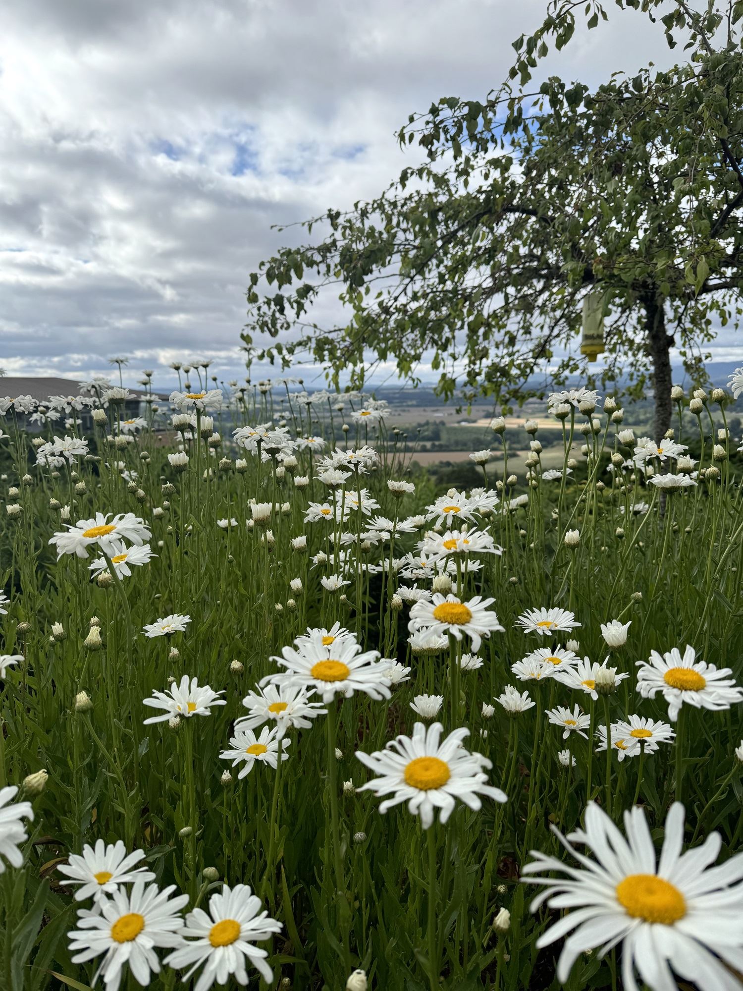
Reference photo for Field of Daisies
Here is another of my recent paintings, Field of Daisies. The original photograph had a lot of information in it… there is an overhanging tree, scattered white flowers, unstructured clouds, and a distant view of Willamette Valley farmland.
My first step when approaching this painting was deciding what to focus on in this landscape. Initially, I wanted to include the overhanging tree in the painting, but after doing some sketches, I decided the tree was distracting from the overall message of the delicate beauty of the daisies.
When mixing my paints, I prepared a subtle variety of off-white hues to use for painting the petals, which captured their shadows and texture, and I mixed a selection of very dark green hues for the grass, to accentuate the whiteness of the flowers. The sky was the trickiest part, since I could not use a strong-colored sky without distracting from my overall message and focus on the white flowers. I needed just enough color and value contrast between the white flowers silhouetted against the sky and the clouds so the viewer’s eye would be drawn up into the sky and produce the feeling of being immersed in a field of wildflowers. You can see how I darkened the sky slightly behind the white flowers to call attention to a mild contrast there. The colors in the sky are harmonious with the colors in the white flowers, and so when gazing at this painting, I want the viewer to just think about the beauty of the white flowers. You can also see how I arranged the flowers a little differently than the photograph, drawing the eye in from the lower edges and the up into the sky using an hourglass shape.
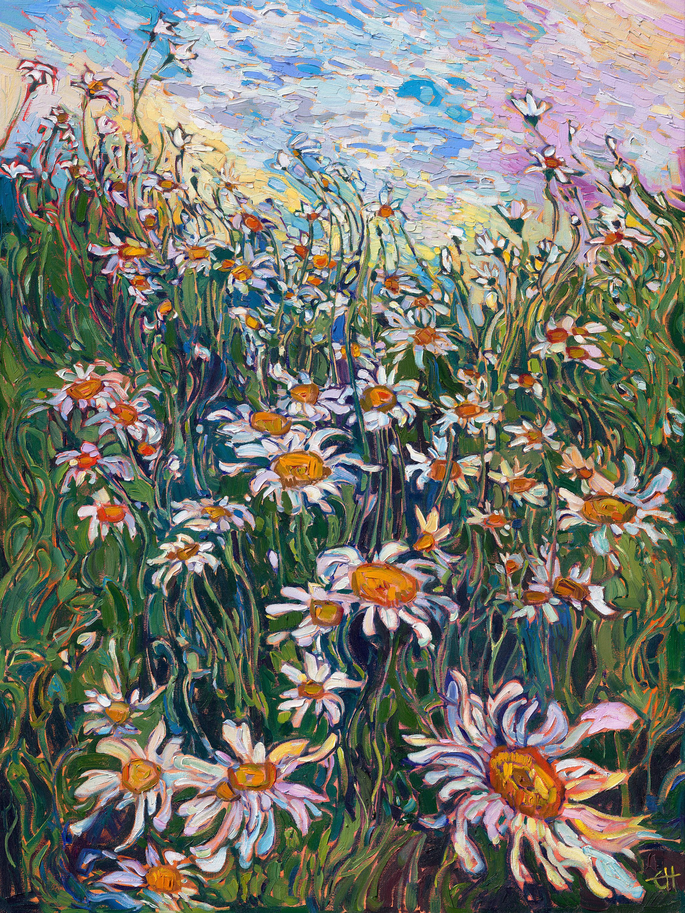
Field of Daisies by Erin Hanson, 2024
I hope these examples give you a clearer sense of how I perceive and use color. To me, color is more than just what I see—it’s a tool to communicate my message, to evoke emotion, and to share my unique vision. As an artist, I don’t feel bound to replicate the exact colors in reference photos. Instead, I select and amplify colors to serve my overall creative intent for the painting.
It is up to the artist to decide what to focus on and what to bring to life in their painting. This is what makes each artist’s vision so special—and so uniquely their own.
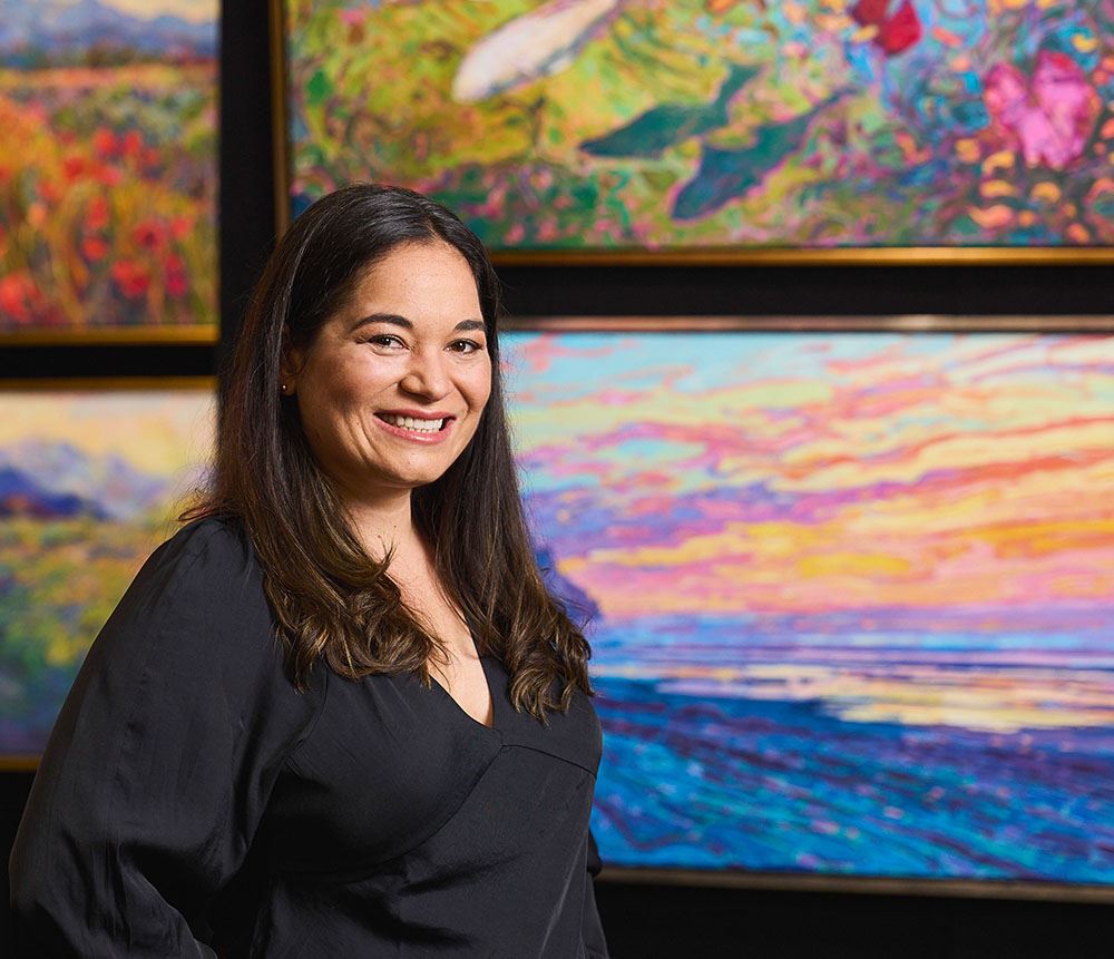
About Erin
ERIN HANSON has been painting in oils since she was 8 years old. As a teenager, she apprenticed at a mural studio where she worked on 40-foot-long paintings while selling art commissions on the side. After being told it was too hard to make a living as an artist, she got her degree in Bioengineering from UC Berkeley. Afterward, Erin became a rock climber at Red Rock Canyon, Nevada. Inspired by the colorful scenery she was climbing, she decided to return to her love of painting and create one new painting every week.
She has stuck to that decision, becoming one of the most prolific artists in history, with over 3,000 oil paintings sold to eager collectors. Erin Hanson’s style is known as "Open Impressionism" and is taught in art schools worldwide. With millions of followers, Hanson has become an iconic, driving force in the rebirth of impressionism, inspiring thousands of other artists to pick up the brush.