Subtotal
$0
U.S. Shipping
FREE
'/%3E%3Cpath class='cls-1' d='M312.91,391.44V462h20.18V428c0-16.15,9.78-20.9,16.59-20.9a15.47,15.47,0,0,1,8.63,2.55L362,391a22.84,22.84,0,0,0-9-1.63c-10.37,0-16.89,4.59-21.19,13.93V391.44H312.91' transform='translate(-88.52 -293.05)'/%3E%3Cpath class='cls-1' d='M455.52,389.37c-10.67,0-18.65,6.3-22.8,12.38-3.85-7.85-12-12.38-21.8-12.38-10.66,0-18.05,5.92-21.46,12.74V391.44H370V462H390.2V425.67c0-13,6.83-19.29,13.2-19.29,5.77,0,11.07,3.73,11.07,13.36V462h20.16V425.67c0-13.19,6.66-19.29,13.33-19.29,5.34,0,11,3.88,11,13.22V462h20.16V413.22c0-15.85-10.67-23.85-23.56-23.85' transform='translate(-88.52 -293.05)'/%3E%3Cpath class='cls-1' d='M263.8,391.44H245.52v-7.17c0-9.34,5.33-12,9.92-12a20.18,20.18,0,0,1,9,2.25l6.22-14.23s-6.31-4.12-17.78-4.12c-12.89,0-27.56,7.27-27.56,30.08v5.19H194.77v-7.17c0-9.34,5.32-12,9.92-12a19.12,19.12,0,0,1,9,2.25l6.22-14.23c-3.71-2.17-9.68-4.12-17.77-4.12-12.89,0-27.56,7.27-27.56,30.08v5.19H162.9V407h11.71v55h20.16V407h30.59v55h20.16V407H263.8V391.44' transform='translate(-88.52 -293.05)'/%3E%3Crect class='cls-2' x='187.32' y='98.39' width='20.14' height='70.53'/%3E%3Cpath class='cls-1' d='M276.58,379.45h19.73c11.51-36.19,50.56-68,97-68,56.48,0,105.29,43,105.29,109.94A137.58,137.58,0,0,1,493,462h19.15l.19-.66a162.2,162.2,0,0,0,4.74-39.89c0-74.65-54.4-128.38-123.73-128.38-54.46,0-103,37.8-116.76,86.4Z' transform='translate(-88.52 -293.05)'/%3E%3C/svg%3E)


Saved for Later
Shopping Cart
Subtotal
$0
U.S. Shipping
FREE
Saved for Later
When I stand before a blank white canvas, my imagination begins filling it in with color. I see the world in hues of magenta, cobalt blue, and viridian green, and I want to capture these colors on canvas.
As an artist, I must narrow down the millions of shades of color my eyes see and simplify the landscape to a few dozen colors that create a cohesive and harmonious statement within the painting.
The first step to creating vibrant color is to apply an underpainting.
I cover my blank white canvas with a thin layer of oil paint. I use student-grade oil paints since they have less pigment and work better as a wash. I thin them out with Liquin, which gives a smooth painting surface and dries overnight.
I often get asked how I choose the color of my underpainting. I could paint the exact same painting on three different colors of underpainting, and I would end up with three very different finished works. A green underpainting makes oranges and reds pop, an orange underpainting makes blues pop, and a purple underpainting makes yellows pop. In other words, the chosen underpainting makes its complementary color more vibrant.
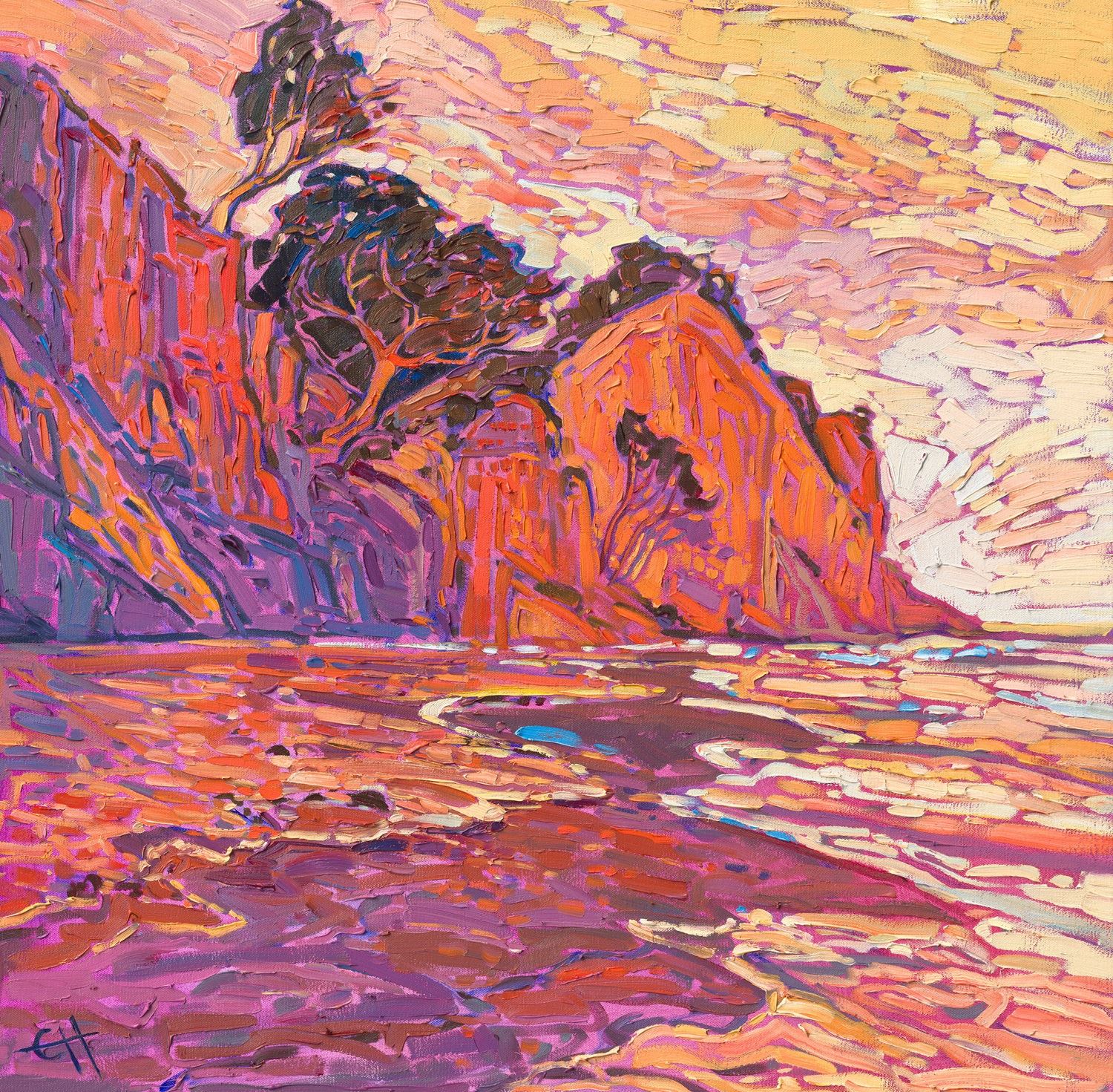
Coastal in Orange by Erin Hanson, 2023
If I want a coastal painting to simmer with the electric colors of the sunset, I will use a red or orange underpainting. If I want the same coastal image to peacefully drift between hues of turquoise and azure blue, I will use an underpainting color closer to blue on the color wheel, such as viridian green.
I often create an underpainting wash that changes color from warm to cool, which gives the painting a feeling of dynamic movement.
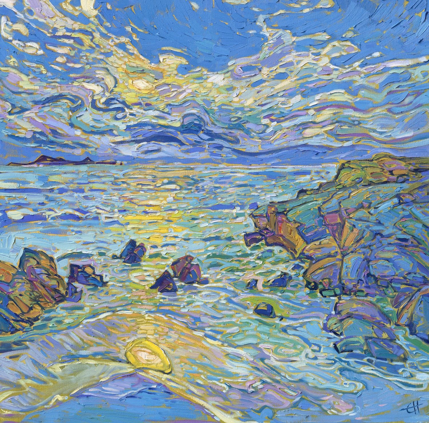
Coastal in Blue by Erin Hanson, 2023
Since I try not to overlap my brushstrokes when I paint, a lot of the underpainting ends up peeking out between my brushstrokes; as a result, the color I choose for the underpainting plays a big part in the overall effect of the work.
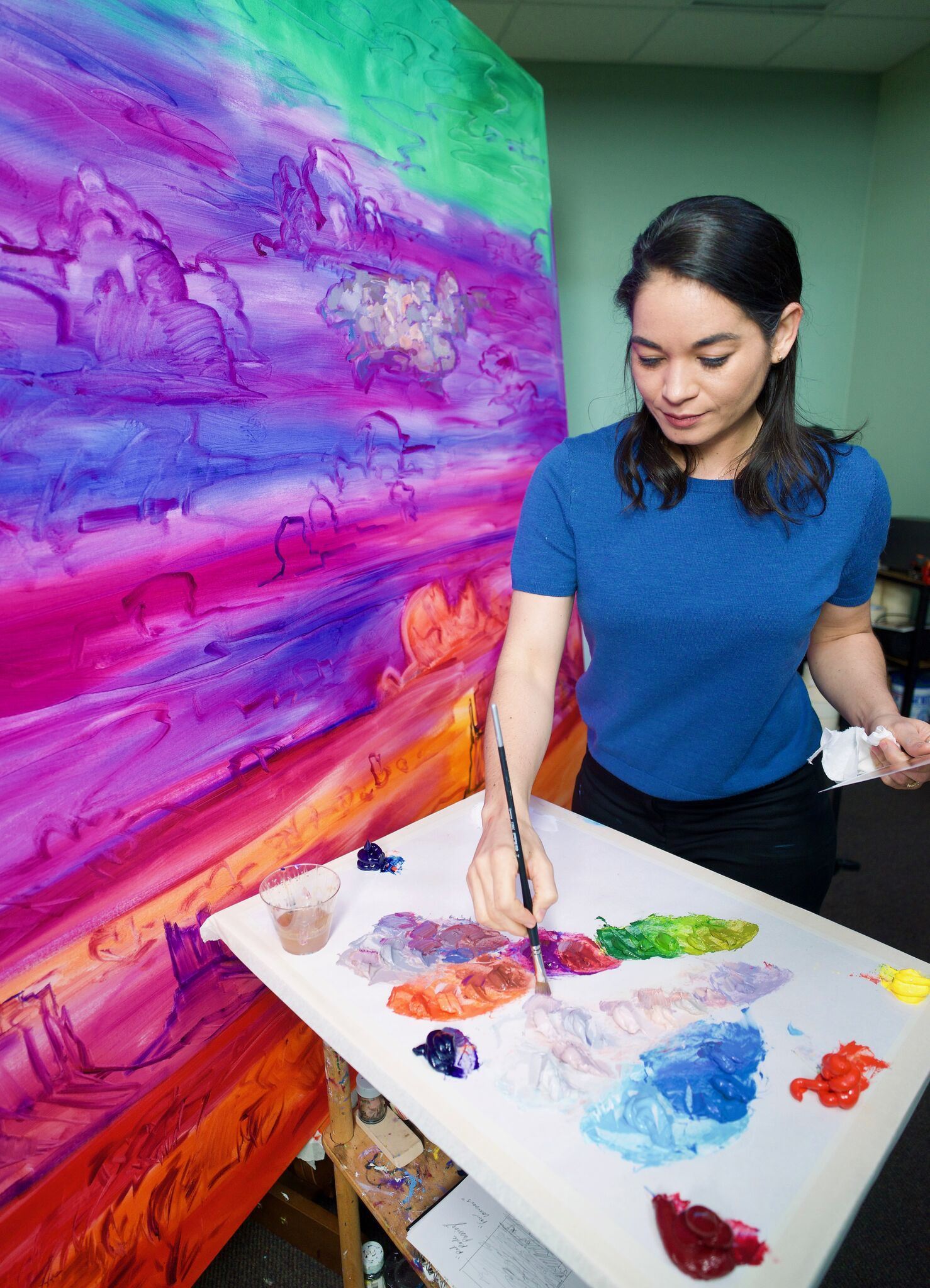
Before I even pick up a brush, I form a clear picture in my mind of what I want the finished painting to look like. The more precise my intentions are before I begin painting, the easier it is to work, and my painting has that spontaneous, “loose and free” feeling that draws you right into the picture. Any given scene I decide to paint can be created on canvas in a dozen different ways, focusing on a dozen different color schemes and employing a dozen different compositional elements–a high horizon line, a low horizon line, sky one-third full of clouds, sky two-thirds full of clouds, high-contrast color, low-contrast color, tree on the right, tree on the left... you get the idea.
To solidify the composition in my mind, I create several pencil sketches with notes on color. Sometimes I will also paint a small, quick sketch on a 5x7 linen board.
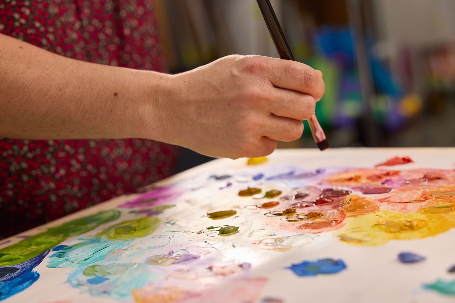
The next step is to mix my palette of colors. I work with a limited palette of only four or five pigments (the pigments themselves might change from painting to painting, but I often stick with these five primary hues: ultramarine blue, phthalo turquoise, permanent rose, cadmium scarlet, and cadmium yellow light.)
I spend an hour or so using a palette knife to mix every single color that I want to appear in the painting. I organize my expansive 24" palette by subject and location within the picture: I mix the cloud’s colors in one section of the palette; the mountain’s light and shadow colors, arranged from near to far, in another section; and the trees’ shadows and highlight colors, again arranged from near to far, in yet another section. (Closer trees are darker and more saturated; distant trees are lighter and bluer.)
By using the right limited palette, it is almost impossible to get muddy colors. I can blend piles of paint together without fear of creating colors that should only be seen stuck underneath your shoe.
I am always amazed at the variety of colors I can create with five simple pigments. Since these colors are on the outside of the color wheel, they are pure pigments with only one ingredient. This gives me a lot more control over my paint, and I can mix my own sap greens, Naples yellows, and red ochres.
When I was twelve years old, I had a job color mixing for a mural studio in La Cañada, California. The head artist would mix a tiny Dixie cup full of an exact hue and then ask me to make a half gallon of that precise color using the hundred or so gallons of acrylic paint in the studio.
I quickly learned that you could move a container of paint around on the color wheel as you please, adding more yellow to make it brighter, adding white to lighten it, adding a drop of cadmium red to make it warmer, adding a dash of blue to tone it down... and so on. In about thirty seconds, I can take my limited palette of five colors and match any color that appears in a photograph.
This is how I create the vibrant colors I see in nature. With each new picture, I continue to experiment with color to make my paintings more alive, more dynamic, and truer to the world of imagination I am creating.
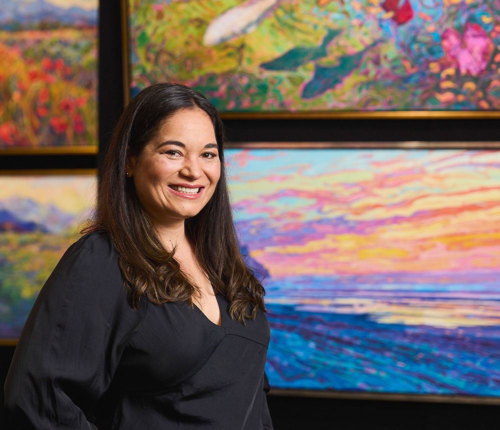
About Erin
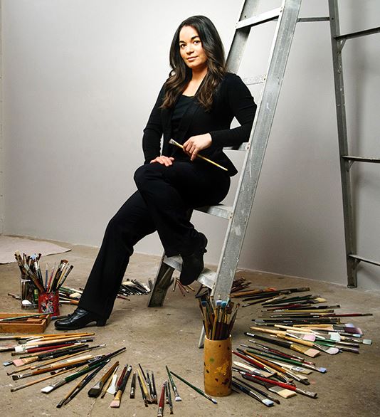
ERIN HANSON has been painting in oils since she was 8 years old. As a teenager, she apprenticed at a mural studio where she worked on 40-foot-long paintings while selling art commissions on the side. After being told it was too hard to make a living as an artist, she got her degree in Bioengineering from UC Berkeley. Afterward, Erin became a rock climber at Red Rock Canyon, Nevada. Inspired by the colorful scenery she was climbing, she decided to return to her love of painting and create one new painting every week.
She has stuck to that decision, becoming one of the most prolific artists in history, with over 3,000 oil paintings sold to eager collectors. Erin Hanson’s style is known as "Open Impressionism" and is taught in art schools worldwide. With millions of followers, Hanson has become an iconic, driving force in the rebirth of impressionism, inspiring thousands of other artists to pick up the brush.