Subtotal
$0
U.S. Shipping
FREE
Saved for Later
Shop Art
Original Paintings
Textured Replicas
Canvas Prints
16x20 Paper Prints
Gift Shop
Portfolio
Browse All
Available Paintings
List of Subjects
Petite Paintings
Large Paintings
Customer Favorites
Contact Us
View Portfolio
Available Originals
Textured Replicas
Canvas Prints
16x20 Paper Prints
Gift Shop
Learn More >
About The Artist
Erin Hanson Biography
About Open Impressionism
Watch Videos
Press Pickups
Blog
Visit
The Erin Hanson Gallery
Exhibition Schedule
Museum Shows
Visit Erin's Studio
For Collectors
Available Paintings
What Are Textured Replicas?
Collector Testimonials
How to Commission Artwork
Notify Me of New Works
For Artists
Open Impressionism Workshop
Artist Mentorship Program
Follow in Erin's Footsteps
Artist Q & A
Erin's Blog
Questions?
Shopping Cart
Subtotal
$0
U.S. Shipping
FREE
Promo codes and taxes are added at checkout.
Saved for Later
Q&A with Erin Hanson
Open Impressionism Painting Technique
What kind of paint do you use?
I have experimented with many paint brands over the years. I like to use certain pigments from certain brands, and other pigments from other brands. It is all about how the different pigments blend together. I mostly use Winsor and Newton's Artist Oils, but I also use Blockx, Michael Harding, and others.
What are the colors you use?
I use a limited palette of four or five paint pigments only. However, these colors often change from painting to painting. I use a Quiller color wheel, which lets me experiment with different color relationships (complementary, split complementary, tertiary, analogous, monochromatic, etc.) As a basic rule of thumb, stick with a limited number of any of the pigments labeled on the outside edge of the Quiller Wheel, and you will be safe! Avoid using colors from the inside of the color wheel. Here's more information about using a limited palette.
What medium do you use to thin your paint?
I use drying linseed oil to thin my paint.
What medium do you use for the underpainting?
For my underpaintings, I use Liquin to thin the oil paint. I use student-grade oils for the underpaintings, since these are less pigmented and lay on more like a wash. The Liquin creates a nice smooth surface to paint on afterwards, instead of a chalky surface created by turpentine.
What are your favorite brushes?
I like Escoda brushes and Old Holland Brushes the best. I mostly use synthetic and genuine Kolinsky sable brushes. When painting, I load my brush with enough paint to create a few brush strokes. I try not to overlap or blend my brushstrokes, getting the painting "right the first time." This gives Open Impressionism a fresh, spontaneous feel.
Do you ever use a palette knife?
I only use a palette knife to mix my paint, never to place paint on the canvas. I pre-mix my entire palette of colors from only four or five pigments. By pre-mixing my palette with every single hue that will appear in the painting, I am fully organized and ready to paint before I ever pick up a paintbrush. I keep my palette (a large 24" palette) sectioned off by painting section: for example, I have a sky section that includes every changing hue of the sky from horizon to apex, as well as every light and shadow color of the clouds, changing color appropriately from near to distant.
What do you do if you aren't feeling inspired to paint?
This only happens if I haven't been outside exploring nature recently. If I am not inspired, it is easy to correct -- I just plan a hiking trip in the local mountains, or an adventure trip to wine country, or a sunset drive down Highway 1, or a week-long excursion through Utah's national parks, for example. Whenever I return from a trip like this, I am brimming over with excitement and fresh ideas to paint. It is impossible to get through all my painting ideas immediately, and the inspiration from a single trip often lasts for months.
How do you go about choosing a color palette for a piece?
The color palette is all about what I want to communicate in the painting. Sometimes I want an exciting, high-contrast piece to accentuate the bright yellow of a grove of aspen trees, for example. In this case, I would use dark, rich purples behind the yellow aspens to make their foliage pop. Sometimes I want to communicate a peaceful, calm landscape, like from a quiet, early morning overlooking the Pacific ocean. In a painting like this, I might use a green underpainting and focus on an analogous color scheme of blues and turquoise.
What drives your use of color?
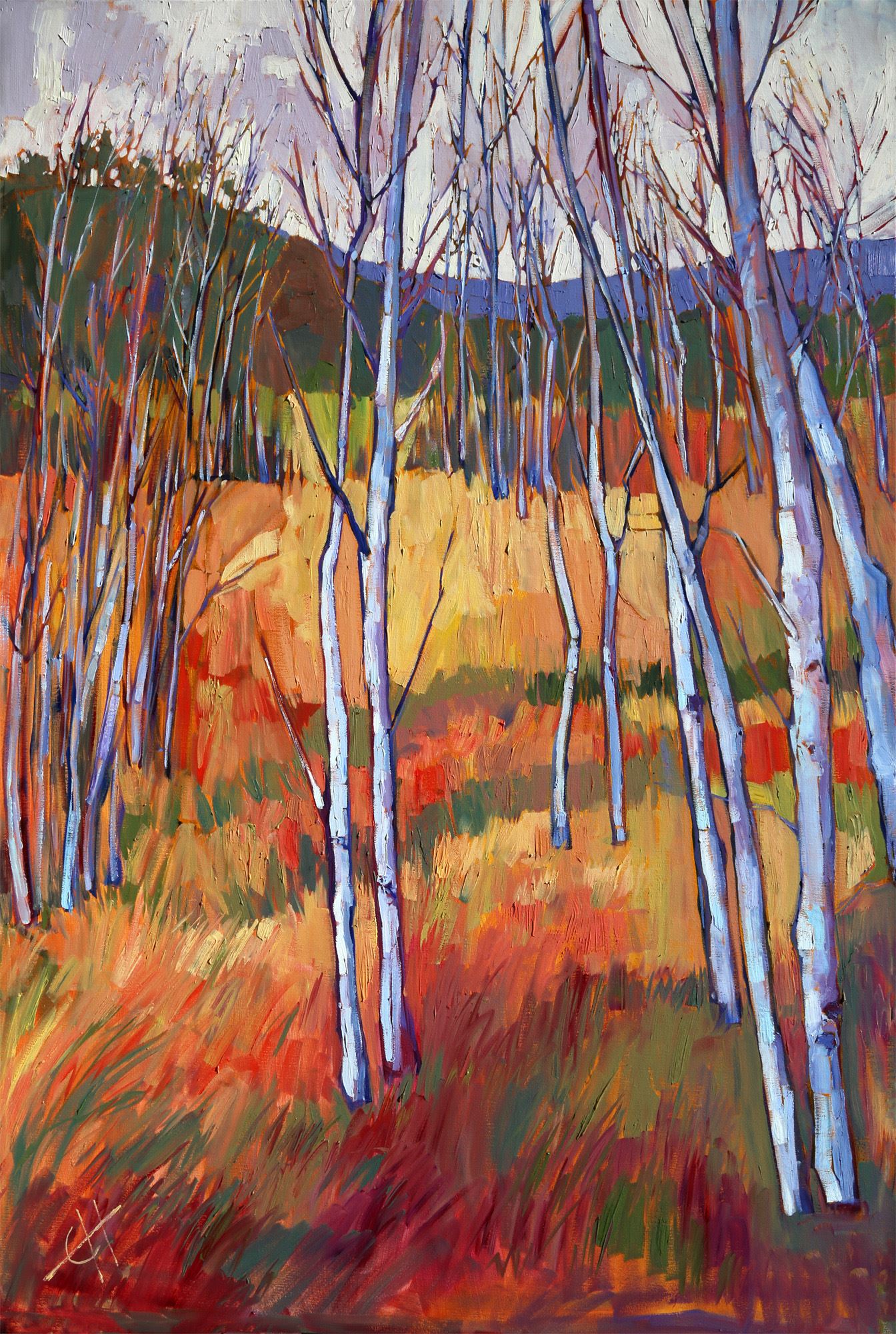
Composition is the most important aspect of my paintings. Composition is the structure of how I will communicate my message in my painting; it is how I tell my story. My message might be, "look at how red those cliffs are compared to the rest of the landscape!" or "look at how the lake creates a perfect reflection of the trees," or "look at how pink those cherry blossoms look against a blue sky," or "look at how the light coming through the clouds only illuminates that one mountain peak," for example. Composition guides all my decisions during a painting: what areas should be light or dark, when to use detail versus when to apply wide brush strokes, when to create atmosphere and distance with value changes, and how to control eye movement throughout the painting.
Color is one of the ways I use composition to communicate my message, my story. I'll give you an example. I was backpacking in Zion National Park on a gray, overcast day. I had attempted to time my backpacking trip to catch all the brilliant fall color of southern Utah, but an early cold spell made all the trees drop their leaves. On day 4 of my trip, I was hiking through a grove of barren aspen trees, and I was struck suddenly by the beauty of their white trunks, so white and so brilliant against the bright orange and yellow fallen leaves, wet and saturated with color from the rain. I saw the landscape in two main color blocks: the white of the tree trunks and the gray of the sky against the brilliant cadmium hues of the wet leaves on the ground.
When I got home, I wanted to capture this story in a painting. I chose my colors based on what I was trying to communicate: how white the trees were, how gray the sky was, and how colorful the fallen leaves were by contrast. You can see how I chose colors in the painting below, to make the most effective communication possible. The result is one of my favorite paintings I created from that 5-day backpacking trip.
I encourage you to have a clear idea of what you want to communicate in your painting, before you ever pick up a brush. Your painting is your unique view of the world, and the more you practice the art of painting, the better you will get at communicating your vision.
Happy painting,
Erin Hanson
Discover the artist at the forefront of modern impressionism.
About Erin
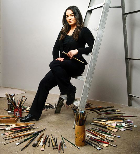
ERIN HANSON has been painting in oils since she was 8 years old. As a teenager, she apprenticed at a mural studio where she worked on 40-foot-long paintings while selling art commissions on the side. After being told it was too hard to make a living as an artist, she got her degree in Bioengineering from UC Berkeley. Afterward, Erin became a rock climber at Red Rock Canyon, Nevada. Inspired by the colorful scenery she was climbing, she decided to return to her love of painting and create one new painting every week.
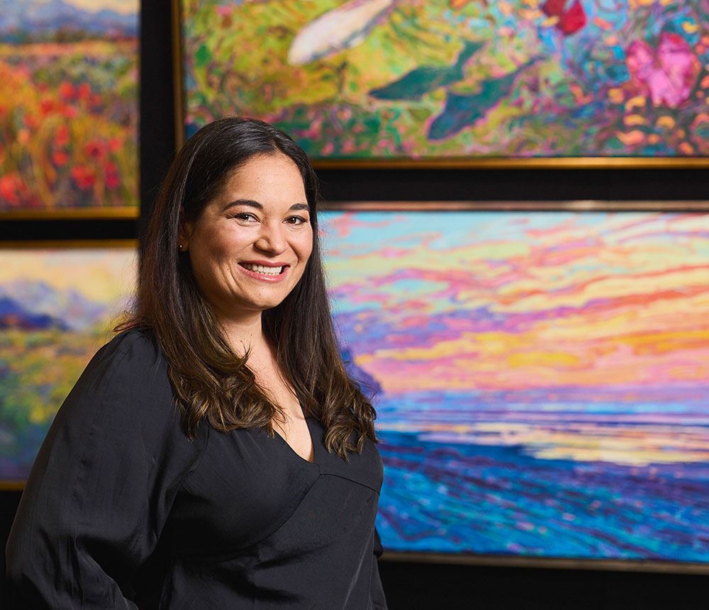
She has stuck to that decision, becoming one of the most prolific artists in history, with over 3,000 oil paintings sold to eager collectors. Erin Hanson’s style is known as "Open Impressionism" and is taught in art schools worldwide. With millions of followers, Hanson has become an iconic, driving force in the rebirth of impressionism, inspiring thousands of other artists to pick up the brush.